Our Logo
The Tetso College logo represents our organisation on the very highest level and is vitally important to our brand. It acts as a signature, an identifier and a stamp of quality. It is, and should always be, the most consistent component in our communications.
In order to maintain this consistency, a few simple guidelines should be followed.
- The Tetso College logo should never be recreated or typeset.
- Only official logo files should be used in communications.
- The College logo available here will serve as the campus’s primary logo and trademark.

The logo should always be afforded a predetermined area of breathing space, referred to as clear space . To ensure that clear space is maintained around the logo for legibility and prominence, photos, text and graphic elements must follow the guidelines illustrated here.
Use the letter “O” as a measuring tool to help maintain clearance.
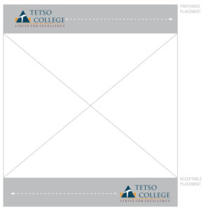 The preferred placement for the logo is in the Upper segment of communications. Anywhere in the outlined areas shown here is acceptable, although corners are preferred. This way, the logo becomes a grounding element that appears consistently on all pieces.
If the upper zone is unsuitable, it is also acceptable to place the logo anywhere in the horizontal segment at the bottom within the piece.
Again, corners are preferred, but the logo can be centered for more formal communications.
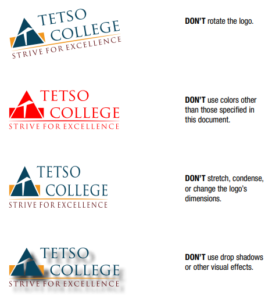 No elements of the logo should be modified. Avoiding these misapplications helps maintain the visual integrity of the brand and allows for a cohesive look across all materials. Some examples of what should be avoided are listed here.
Tips:
• Maintain the proportions of the logo as shown.
• Do not obscure any part of the logo.
• Do not add a drop shadow or any other special effects to the logo.
Download our Official Brand Logos here:
Our Colour Palette
Beyond the logo, color is the most recognizable aspect of the brand identity. Colors were selected that reflect the bold, diverse community and given names that reflect their inspiration. Using color appropriately is one of the easiest ways to make sure your materials reflect a cohesive Berkeley image or visual story.
Primary Palette
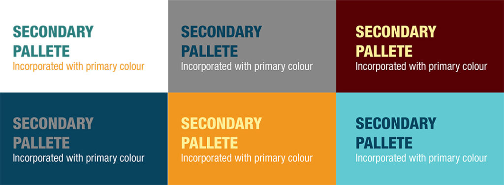
The Primary Palette is made up of the full-color logo colors plus white. They are to be used across all communications and applications, including as background colors and body copy.

HEX #08445e
RGB 8 68 94
CMYK 97 69 42 29

HEX #f1971f
RGB 247 151 31
CMYK 3 47 100 0

HEX #570004
RGB 87 0 4
CMYK 39 93 84 61

HEX #FFFFFF
RGB 255 255 255
CMYK 00 00 00 00
Note: When using color builds, always use the color values listed here. They were adjusted for the best reproduction in print and on screen.
Secondary Palette
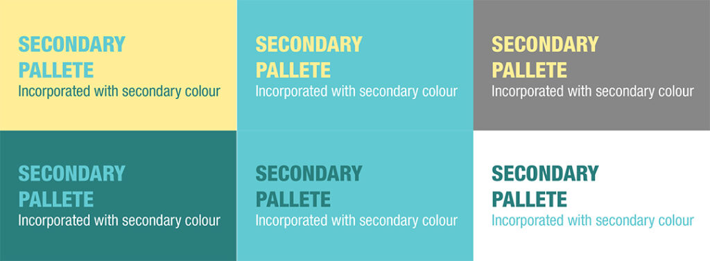
The Secondary Palette includes the Primary logo colors and builds on them. The secondary palette represents youthful energy and diversity. These colors work especially well as accents or background color washes. An offcial secondary colour pallete is essential to remove the barriers of branding communication limited by the primary colours.

HEX #48C9CC
RGB 72 201 204
CMYK 62 0 24 0

HEX #878787
RGB 135 135 135
CMYK 49 41 41 5

HEX #ffed97
RGB 255 237 151
CMYK 1 3 50 0

HEX #2a7f7d
RGB 42 127 125
CMYK 82 33 50 9
Topography
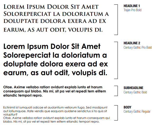
When used thoughtfully, typography becomes a powerful brand tool that can add visual meaning to what is communicated. Tetso’s typography communicates clearly and cleanly, and is flexible in a wide range of situations.
Flexibility comes from using one type family that contains all necessary styles. Trajan Pro & Century Gothic is the Typeface of Tetso Brand.
