- The Tetso College logo should never be recreated or typeset.
- Only official logo files should be used in communications.
- The College logo available here will serve as the campus’s primary logo and trademark.
![]()
The logo should always be afforded a predetermined area of breathing space, referred to as clear space . To ensure that clear space is maintained around the logo for legibility and prominence, photos, text and graphic elements must follow the guidelines illustrated here.
Use the letter “O” as a measuring tool to help maintain clearance.
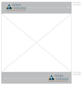 The preferred placement for the logo is in the Upper segment of communications. Anywhere in the outlined areas shown here is acceptable, although corners are preferred. This way, the logo becomes a grounding element that appears consistently on all pieces.
If the upper zone is unsuitable, it is also acceptable to place the logo anywhere in the horizontal segment at the bottom within the piece.
Again, corners are preferred, but the logo can be centered for more formal communications.
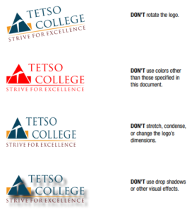 No elements of the logo should be modified. Avoiding these misapplications helps maintain the visual integrity of the brand and allows for a cohesive look across all materials. Some examples of what should be avoided are listed here.
Tips:
• Maintain the proportions of the logo as shown.
• Do not obscure any part of the logo.
• Do not add a drop shadow or any other special effects to the logo.


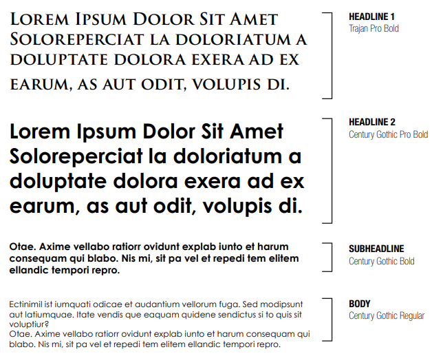
When used thoughtfully, typography becomes a powerful brand tool that can add visual meaning to what is communicated. Tetso’s typography communicates clearly and cleanly, and is flexible in a wide range of situations.
Flexibility comes from using one type family that contains all necessary styles. Trajan Pro & Century Gothic is the Typeface of Tetso Brand.